Task 2.2
Understanding ideas.
How is the brand identity enhanced (or perhaps, not expressed) at the point of customer interaction?
In this task I choose to do research on IKEA brand. The brand is well-known and my task is to visit the shop and see how their products are displayed or distributed.
1. The branding element IKEA is using in their logo is WORDMARK. The types has a meaning and tells about the identity.
I – Ingvar (the first name of the company’s founder)
K – Kamprad (the surname of the company´s founder)
E – Elmtaryd (the name of the farm where Kamprad grew up)
A – Agunnaryd (the name of his village)
2. IKEA´s brand positioning is to be the leading home furniture experts who offer quality and design products to a lower price.
“To create better everyday life for the many people” From beds and mattresses, organization appliances, rugs, décor, kitchen and furniture, the brand provides everything you can think of to make your life good.
The colours of the logo and brand also is a part of their identity. Blue and yellow is the colours in the Swedish flag. It also identifies the main style Scandinavian Design. Everything in this company relate to the Swedish and Scandinavian history and culture. Such as light, material, style history, humanism and handcraft.

The target group I think is single and in relationship 20 – 45 years old, but also family and children.
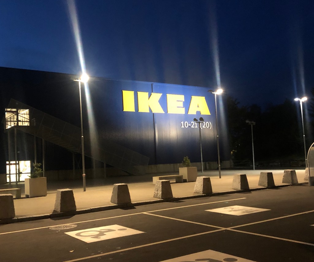
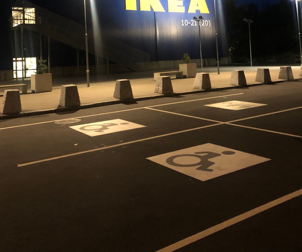
3. At the shop it is easy to see the logo and the identity of IKEA, first you meet a “Welcome” , it is easy to find a place to park your car and you can find sign for family, electric car and handicap parking.
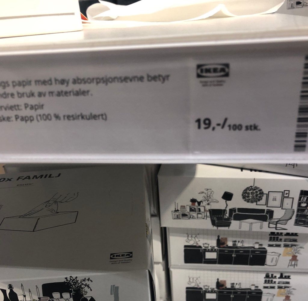
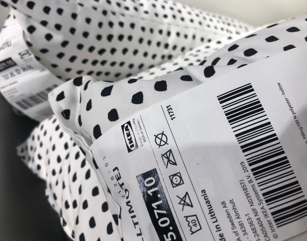
You can see the logo everywhere, it`s included in everything you see, shelf tag, price tag on product, price signs and on the product itself.


The blue and yellow is also easy to see all the way throe the store

The product selection is something for everyone and for every wallet.
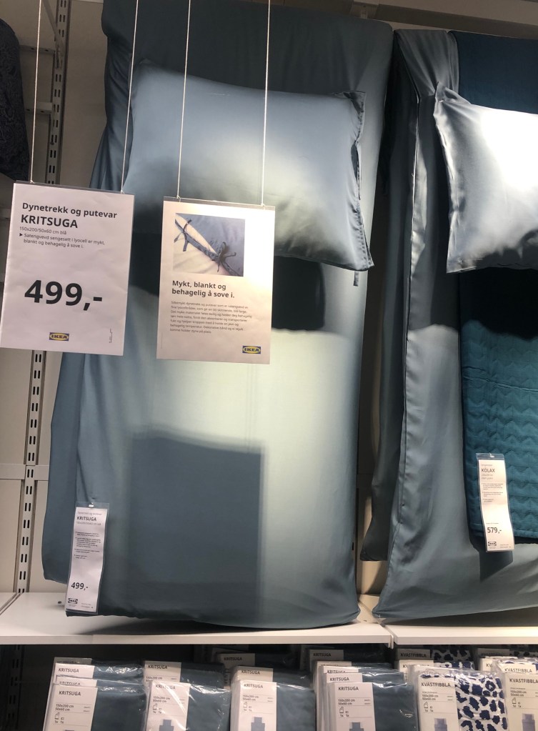
There are displayed products in different style, different, price and given good home furnishing tips for storage, quality and how to mix colours.


for example this kitchen for children.
4. When you arrive to the store the brand positioning is clearly, outside you meet the Swedish flag and the flag for the country the stores’ location is. There are also flag with the logo.
In the entrance you find a product on the wall with a good and low price, there is also displayed products on podium whit home furnishing expertise to create inspiration and knowledge to the costumer. All the way thru the market hall you find home furnishing expertise, and customer benefit communication.
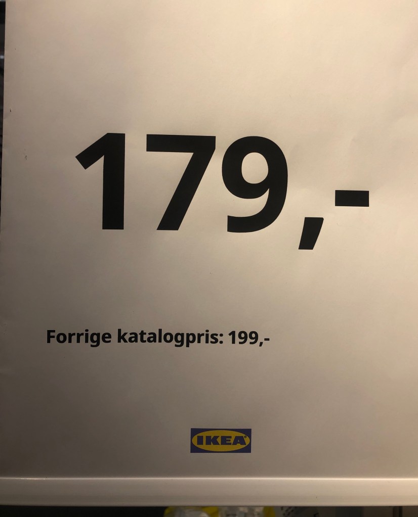
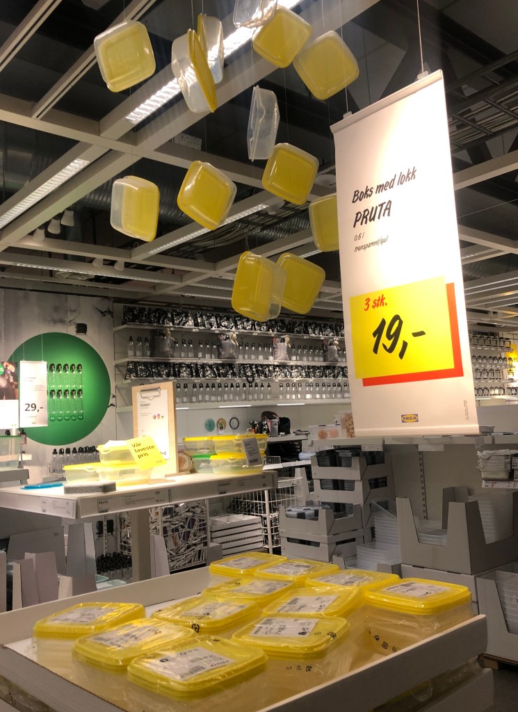
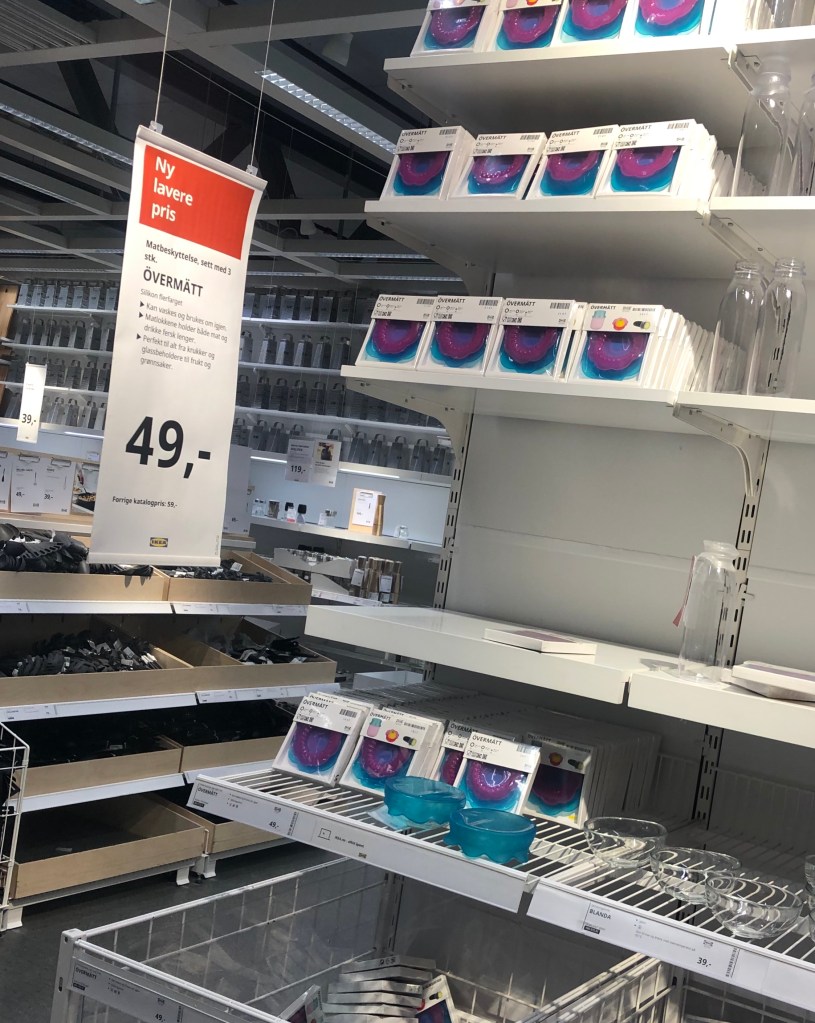
The low price is easy to find and are displayed all the way true the store in every range.


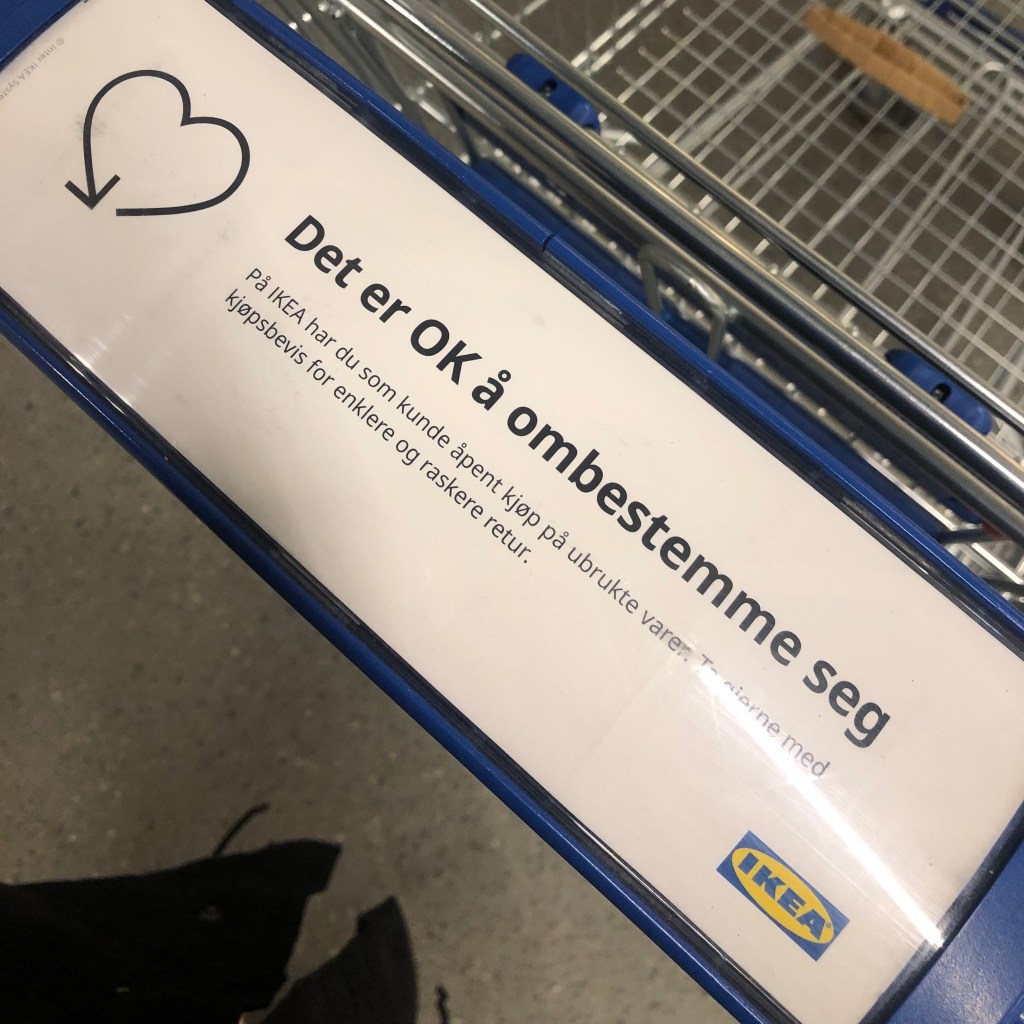
This break gives the customer information about environment and is a part of the sustainability strategy.
The logo is visible everywhere and because of the good known brand I see it as a quality stamp.
5. The brand ideal is quality design for a low price. IKEA display their product in different technique depending of price and quality. I can also see that they are up-date on season.
Example of display technique’s they use to show difference on price and quality.

Example of display that shows home furnishing expertise.


How display shows innovation and high price. High price at IKEA is low price in the market

This display gives a home furnishing expertise also using communication. And the logo in colour gives it the final touch.

Living with children displayed. You also find product for children in other areas in the store.

The IKEA brand is strong and the visual display accord to the brand ideal, back at the parking area I find board that communicate home furnishing, low price, logo, colour identity and product right for the season. You can see a strong link to the brand identity, store, internet and communication.

