My Reflective Journal
Ever since I was a child I have loved drawing and coloring. I remember that I liked the tasks at school where we got to draw and color together with text. I have always loved handcrafts and was introduced to many types of crafts at an early age.
Since these where my interests from a young age, I knew that this was the direction to go further on in life. Due to the education and to the interests I hold, the working experiences I have, has relied on working as a Visual Merchandiser to different companies and stores. Working in different companies has given me experience within not only sales and marketing, but also communication and costumer relation.
My passion for Graphic Design has only increased with every year that has passed, and is why I decided to apply for this specific education. Grapic Design is a great build-up to my already existing education and work experience. My goal is to work with Graphic Design in the future, in what way…the future will tell.
About Me
Hi, I’m Line. I’m a Visual Merchandiser and Interior Designer, I now is a full – time student at Graph Design, Noroff. this blog is going to show my work during my studies.
Subscribe to My Blog
Get new content delivered directly to your inbox.
Schedule and Deadlines
23.08.2021: Course Assignment 00 – Introduction week
Handout: 17.08.2021
03.09.2021: Course Assignment 01 – Graphic design
Handout: 23.08.2021
08.10.2021: Course Assignment 02 – Strategic design
Handout: 20.09.2021
29.10.2021: Semester project description
Handout: 21.10.2021
12.11.2021: Course Assignment 03 – Graphic Design
Handout: 26.10.2021
26.11.2021: Course Assignment 04 – Photography
Handout: 13.10.2021
10.12.2021: Semester project
Handout: 20.10.2021
17.12.2021: Portfolio 1
Handout: 23.10.2021
28.01.2022: Course Assignment 05 – Design for screen
Handout: 04.01.2022
11.02.2022: Course Assignment 06 – Photography
Handout: 31.01.2022
25.03.2022: Course Assignment 07 – Design for screen
Handout: 14.02.2022
08.04.2022: Semester project description
Handout: 01.04.2022
29.04.2022: Course Assignment 08 – Graphic Design
Handout: 28.03.2022
03.06.2022: Project Exam
Handout: 01.04.2022
10.06.2022: Portfolio 2
Handout: 01.04.2022
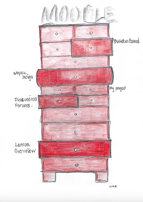
1.2 Moodle Illustration
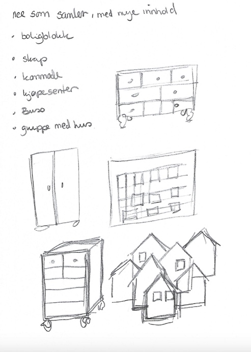
my first sketches.


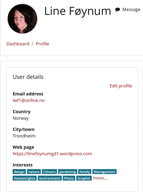
1.3 Create a profile on Moodle
Task 1.3 asked us to create a profile on Moodle. Add a profile picture, some description of yourself and some interests.
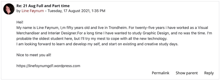
1.4 We were going to present ourselves for the class list on Moodle. Together with our presentation would add a link to our WordPress blog.
Module 1 – Introduction to Idea Development
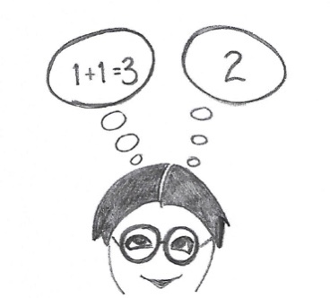
1.1 Lateral Thinking
What are they communicating ?


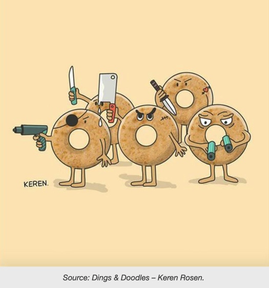


Some of my own ideas….

1.2 Ideation
There are plenty of IDEATION TECHNIQUES available. I did some research on internet and found some good examples.
Systematic Inventive Thinking (SIT)
SIT is a practical approach to creativity, innovation and problem solving, which has become a well known methodology for innovators.
Five thinking tools
- 1.Substractin
- 2.Multiplication
- 3.Division
- 4.Task unification
- 5.Attribute dependency
What is the meaning of Inventive thinking? The definition of innovative thinking is the ability to come up with new ideas and novel approaches to problems. It is about being creative and flexible.Innovative thinking is in reality creative problem solving, and it’s a skill that you can develop and use at work – whatever your role.
Popular Ideation Techniques to Try:
- Brainstorming. In a brainstorm, the goal is to leverage the power of the group to build on each other’s ideas.
- Method 6-3-5. Method 6-3-5 is a form of brainstorming in which six people write down three ideas in five minutes.
- Prototyping.
- Five Whys Analysis.
- Storyboard.
- Mind mapping.
In this task I was asked to choose three that I would like to try in the future or have used before.
Brainstorming.
Brainstorming is a well known ideation technique to me, I use it every time for starting a creative process. Whit every method of brainstorming the most important ting to remember is to follow the rule, quantity over quality. Brainstorming I aided by accepting all ideas.The goal is to create a large enough pool which to pull the best ideas and the best solutions. There are a lot of brainstorming techniques. Rapid ideation is one of them, everyone writes down as many ideas as possible in a set amount of time, before any ideas are discussed, critiqued or removed. For this technique you will need to set a time constraint, otherwise you’ll risk loosing the sense of urgency. tis exercise can be helpful to avoid the all-to-common scenariowheen an idea is shot down before it has time to grow.
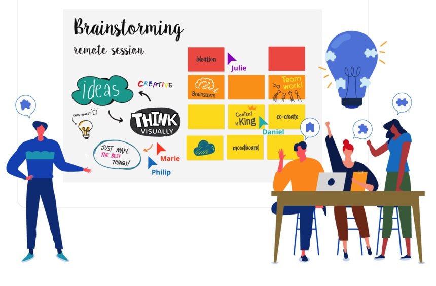
Brainstorming is a technique I have used and will use in the future.
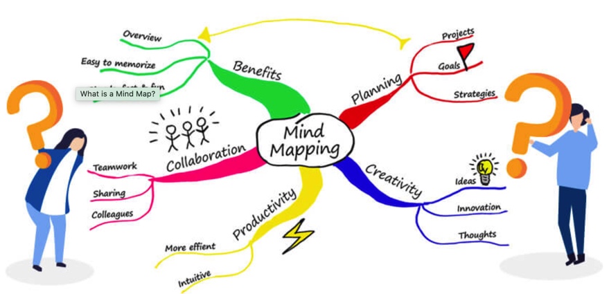
Mind mapping
A Mind Map is an easy way to brainstorm thoughts organically without worrying about order and structure. It allows you to visually structure your ideas to help with analysis and recall. A Mind Map is a diagram for representing tasks, words, concepts, or items linked to and arranged around a central concept or subject using a non-linear graphical layout that allows the user to build an intuitive framework around a central concept. A Mind Map can turn a long list of monotonous information into a colorful, memorable and highly organized diagram that works in line with your brain’s natural way of doing things.
Sketching
When designing a product, you may want to incorporate sketching to help explore your ideas further. Some people have an easier time conveying their ideas visually rather than verbally, and it can help your team think about more abstract concepts. There is no pressure to create a perfect or final image of your product, as these should be rough drafts or simple sketches that illustrate your ideas. Collaborative or group sketching is similar to brainwriting, but each participant draws ideas instead of writing them. These drawings are then passed around and built upon by other participants, and finally presented to everyone and discussed. During this discussion, you may find connections between the drawings that will help you create the most optimal design solution. Again, this is a good option for more artistically minded teams and also ensure that everyone’s ideas receive consideration from the group.
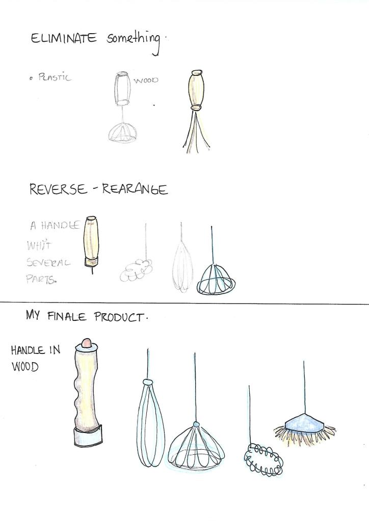
1.3 SCAMPER packaging.
In this lesson task I will try to create a packaging for a lightbulb that should be different from the packaging that is already on the market. To do this, I will use the SCAMPER method which consists of these seven techniques:
Substitute something
Combine it with something else
Adapt something to it
Modify or Magnify it
Put to other uses
Eliminate something
Reverse or Rearrange it
The goal of the SCAMPER method is to create new and diverse ideas.
I started this task writing down everything I taught of with a lightbulb. to SUBSTITUTE the already design I had ideas about a big pack for a lower price, eco-friendly material and color , if I could do anything about the size and information about sustainability on the package. The shape I also made some sketches of, trying to find one that protect the bulb from breaking, and is easy to store in the shop.

it is important to have a material who is sustained and who protect the lightbulb from braking. I think that cardboard white eco-friendly color and that can be recycled is a god choice . To COMBINE the bulb whit some other products I think it is important to find something related, something who naturally fits together, like a sun cellar lamp or take the bulb and split it up, and change only the part of the bulb that are broken.

to ADAPT something to the produkt I have an idea about using one side of the package to create an activity for children, this can be a picture , a message or a awareness of environmental behavior and learn about eco-friendly stuff. can be puzzling or building blocks. I also have an idea of color code the package for easy to buy the right size. the box can be used in second to grow plants or as a lampshade .

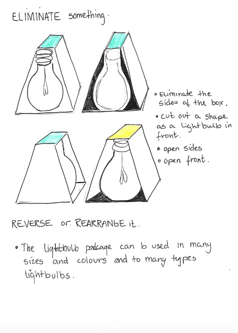
Because of the environment I want to find å god way to secure the safety for the product not using more corrugated cardboard than necessary. I want to remove the to sides of the box, then I save cardboard and the costumer can easy see the shape and size of the lightbulb. I choose not to have plastic only open, to save the environment. this type of package can be used to all types of lightbulbs.
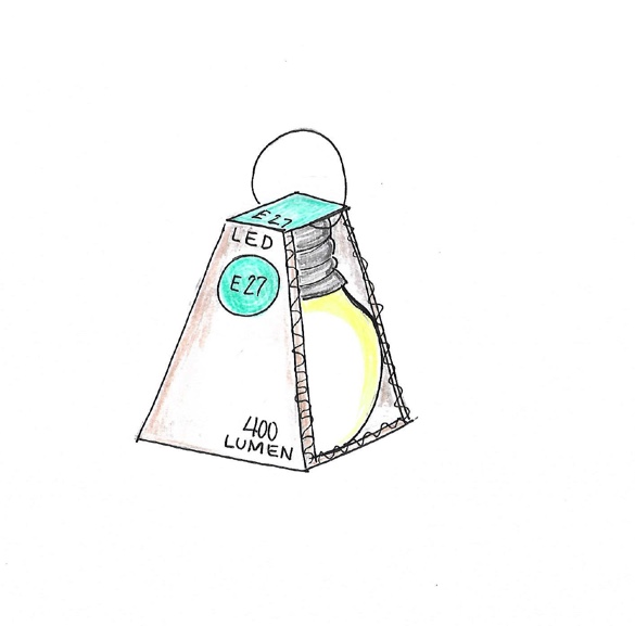
This is my finale product , it looks sustained , gives the bulb protection so it not get crushed or breaks. it is important that the box looks like quality, because the bulb is long lasting and energy saving. the package is easy to find, because of the form and color , and easy to buy because of the color coding for size and open side for seeing the form. I also think it will be easy to store, because it can be placed up side down and opposite , still easy to see the product and information . I also made it possible to hang on a peg.
MODUL 2 – SKETCHING TECNIQUES
2.1. Scamps
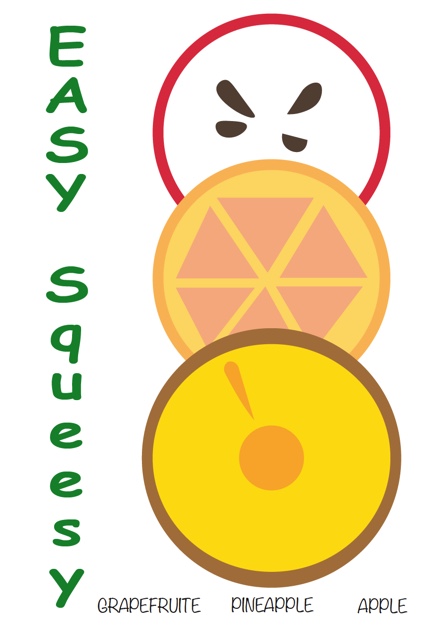
I`m brifed to illustrate fruit juice packaging (grapefruit, pineapple, and apple flavor). The name of the product is Easy Squeezy. Draw at least 15 scamps, A6 size each, of what the label will look like. Include the, the name of the flavor and the name of the product .Choose one of the sketches and draw a label using Adobe Illustrator.
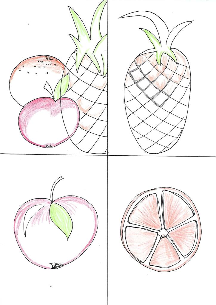


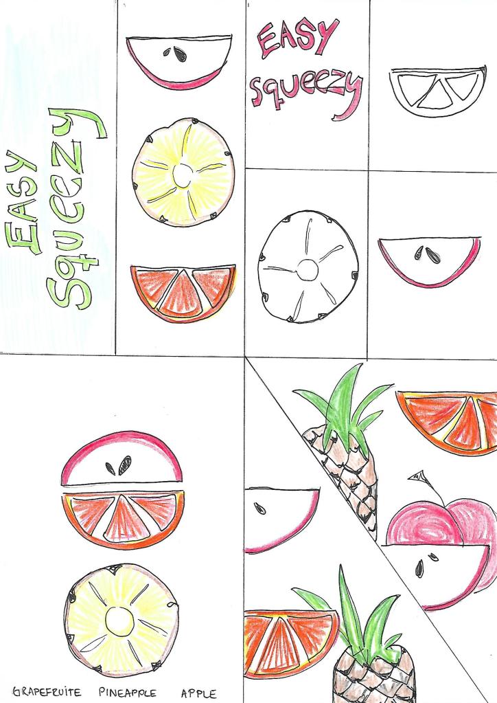
I wanted the illustration to be colorful and fresh. I sketched up many examples, but my Illustrator skills limited what I managed. I did my best for now and I´ll come back stronger after more practice. so this is what I ended up with.
2.2 Collaboration
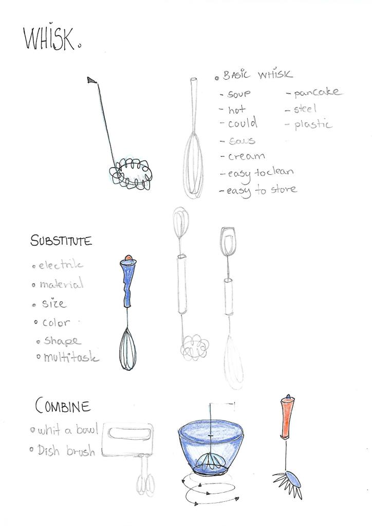
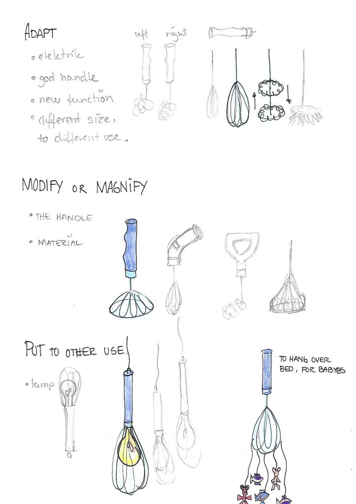
You are given a whisk as an object. Now apply each one of the SCAMPER techniques to it to develop a new product. Give a brief explanation of what the new product is and how it can be marketed.
2.3 History of graphic design
Five events that have impacted modern graphic design.
Expressionism Graphics – 1910
Expressionism is an art movement that emerged in Germany and Austria around 1912. Expressionism, which prioritises sentiment over realism, uses a non-realistic representation of artefacts and events to elicit emotion in audiences. This was a break from the Realism tradition that began in France in the mid-nineteenth century.The Brücke (The Bridge) and Der Blaue Reiter were the two major expressionism parties (The Blue Rider). Both parties employed fabrication, primitivism, imagination, and procedural elements in a lively, clashing, aggressive, or complex manner. They depicted their subjects’ spirituality rather than only what was seen on the table. Colour was used experimentally by the expressionists, and their dramatized styles reflected the exotic qualities of their subject matter. The use of heavy brushstrokes, darkness, and deep colour to express emotion are hallmarks of the theme

Art Deco – 1930
The Art Deco era came to an end with the beginning of the Second World War, which ushered in a new attitude to design, characterised by strict functionality and the unadorned styles of modernism.Art Deco style drew inspiration from an eclectic combination of influences, materials, and previous art movements. Following its birth in Paris, the movement quickly gained a following around the world, adopting slightly different characteristics in each location and influencing a variety of creative disciplines, from design to visual arts to decorative arts, architecture, and fashion. In spite of the range of influences, Art Deco styles are unified by a celebration of the future, glamour, elegance, an emphasis on functionality, and an embrace of bold new ideas.
- Art Deco Colour Palette: Art Deco colours tend to be rich, bright, and vibrant, an influence of Fauvism and the Ballets Russes. There’s also often a liberal use of gold, particularly in Art Deco typography.
- Art Deco Lines: Art Deco lines are straight, hard-edged, and smooth. Think streamlined elegance and sleek, exaggerated curves.
- Art Deco Shapes: Art Deco shapes are usually bold, geometric, and symmetrical, and may include zigzags, chevron arrangements, and trapezoidal shapes

Pop Art
Pop Art is an art movement that emerged in the United Kingdom and the United States during the mid- to late-1950s. The movement presented a challenge to traditions of fine art by including imagery from popular and mass culture, such as advertising ,comic books and mundane mass-produced objects. One of its aims is to use images of popular culture in art, emphasizing the banal or kitchy elements of any culture, most often through the use of irony. It is also associated with the artists’ use of mechanical means of reproduction or rendering techniques. In pop art, material is sometimes visually removed from its known context, isolated, or combined with unrelated material.

photoshop – 1990
Photoshop initial release was an event that changed graphic design forever. It released its first version in 1990 and started a revolution. It created a completely new digitalized industrial standard. Later it has impacted the world in both positive and negative light. For design it is still mostly positive, as it is an incredibly powerful tool that has almost no limits in execution. However, it has had a negative aspect on commercial and the expextations towards how young people look. With retouching models until they are no longer recognizable.

MODUL 3 – TYPOGRAPHY
3.1 Expressing meaning
Expressing meaning in typography and composition.


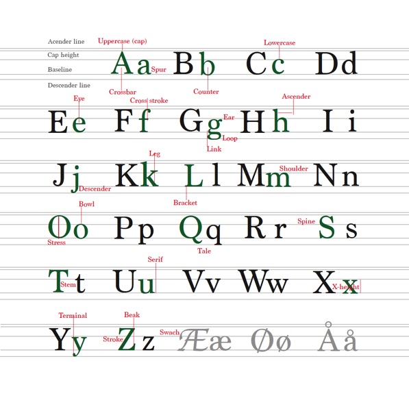
3.2 The anatomy of type.
This task involves working with typography in layout.
For this task, I need to explain the anatomy of type visually, using the entire alphabet (upper and lower-case).
3.3 Designing a film festival poster.
MODUL 4 – COLOUR THEORY.
4.1. Colour Theory.
1. Working with colors there are thousands of variations to each colour so its important to be specific. This becomes more important when we are dealing with printed material as logos and brands. to achieve this printers and designers use a special colour code named PANTONE, this are standardized colors that tells exactly which colour use. therefore we use colour system.
RGB colour system.
- R = RED
- G = GREEN
- B = BLUE
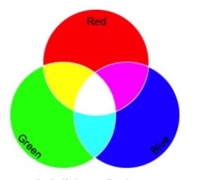
The RGB system is built on the Additive system. Colors on the screen are created with light and begins White and ends with Black, as more colour we add the result is lighter and tints toward white. It also means that a colour is created of the effect of light moving directly into the eye. Colours created in the additive system appear brighter. more colors can be created in the additive system than the subtractive system.Digital design take place in RGB, it have a million colours and are used in onscreen media. This theory states that all perceivable colors can be made by mixing different amount of red, green and blue light.
CMYK colour system.
- C = CYAN
- M = MAGENTA
- Y = YELLOW
- K = KEY / BLACK

The CMYK system.
In the subtractive color model, pigment is used to produce color using reflected light. … The subtractive colors are cyan, yellow, magenta and black, also known as CMYK. Subtractive color begins with white (paper) and ends with black; as color is added, the result is darker. That means that colours The subtractive color mixing model predicts the resultant spectral distribution of light filtered through overlaid partially absorbing materials on a reflecting or transparent surface. Each layer partially absorbs some wavelengths of light from the illumination spectrum while letting others pass through, resulting in a colored appearance. The resultant spectral power distribution is predicted by sequentially taking the product of the spectral power distributions of the incoming light and transmissivity at each filter. if yo work whit prints it takes place in CMYK system.
2. White use of Adobe colour I developed four different colour schemes.
A. MONOCHROMATIC

B. COMPLEMENTARY

C. TETRAD
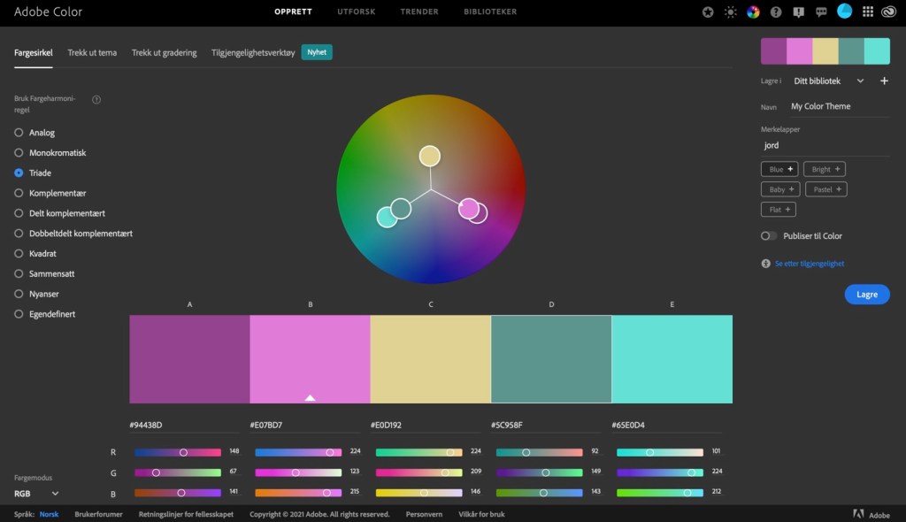
D. ANALOGOUS

4.2 Create colour effects.
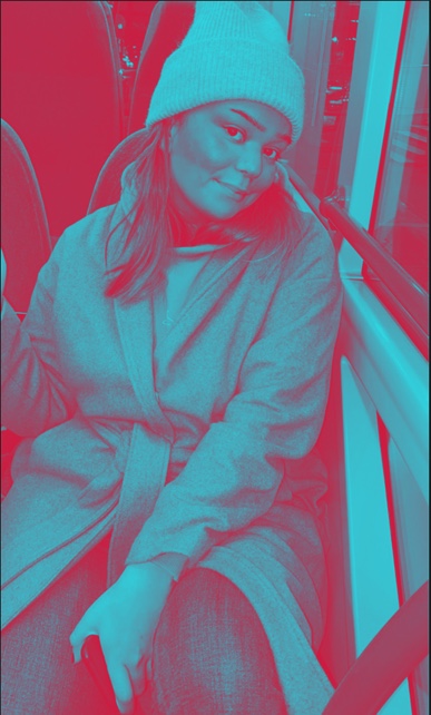
I use a photo of my own choice and create the following colour effects. I will four separate works of the same photo with the following effects:
- Create a fluorescent duotone using a Gradient Map adjustment layer.
- Apply a monochrome look
- Split toning of the image (Ps – Color Gradient )
- Effect of my own choice.
The original picture.

- Flourescent duotone.
2. Monochrome.

3. Split Toning.

4. my choice is to use different Split Toning effects.


4.3 Design a book cover.
In this task I am designing a book cover, I chose ” The lord of Flies” by Golding. I need to chose one of the colour schemes and explain why I chose this scheme.

MODUL 2- Brand Integration
TASK 2.1
Logo identity.
The use of colour, typography, visuals.
The Instagram logo have a colourful and friendly identity colour. It also give a feeling of play,fun and creativity.The rainbow colour gives the logo an active look, easy to use.
The typography is in this image the outline who is curvy, which gives an easy and friendly look.
Visuals are simple and playful, and it shows a simplified camera. I think also it looks loke a Butten “easy to press”.

TASK 2.1
The Mercedes logo is a metal star. The colour is a steel metal colour. Steel is strong and unbreakable and solid.
The typographic is serif and tells me that it is an old brand that want to tell us about a family or history tradition.
I get a feeling of quality and a product not for everyone, its hard to get because it is expensive. The style is classic and built on old tradition, old and solid.
I have learned that the Three-Pointed Star symbolize strength and prevalence of engines on the land, on the sea and in the air.
For me the star identifies with a jewelry, something expensive and something to collect. “To get the star” can also for someone be a dream.

TASK 2.1
MasterCard logo is easy to see because of the red colour. I get a feeling of sharing, because the orange is a colour that comes out of red and over to yellow. The colour also gives me a feeling of emotions like love and speed.
Typographic is sanserif,
for me it looks like the target group is modern, business and busy people who need an easy way to pay.
The two circles can be a symbol for coins (money) or the same shape as the earth globe. Easy to use all over the world. When you know what Mastercard is and analyses the visual I think that the three shapes tell something about how much money you can borrow, how much you have and hove much you have paid back.

2.
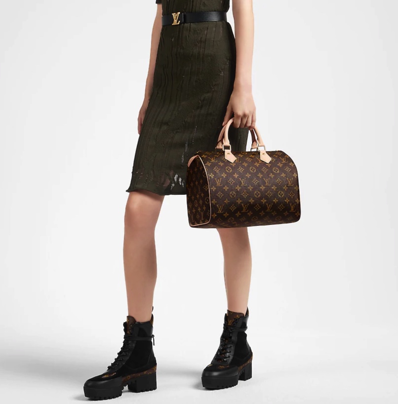
LOUIS VUITTON – The speedy 30 monogram
The Louis Vitton brand and the LV monogram are among the most valuable brands in the world. According to a Millward Brown study, Louis Vuitton was the the world`s 19th most valuable brand.
- Louis Vuitton Malletier commonly known as Louis Vuitton or by its initials LV, is a French fashion house and luxury goods company founded in 1854 by Louis Vuitton. The label’s LV monogram appears on most of its products, ranging from luxury trunks and leather goods to ready-to-wear, shoes, watches, jewelry, accessories, sunglasses and books. Louis Vuitton is one of the world’s leading international fashion houses.
- The Louis Vuitton label was founded by Vuitton in 1854 in Paris, France. Louis Vuitton had observed that the HJ Cave Osilite trunk could be easily stacked. In 1858, Vuitton introduced his flat-topped trunks with Trianon canvas, making them lightweight and airtight. Before the introduction of Vuitton’s trunks, rounded-top trunks were used, generally to promote water runoff, and thus could not be stacked. It was Vuitton’s gray Trianon canvas flat trunk that allowed the ability to stack them on top of another with ease for voyages. Many other luggage makers later imitated Vuitton’s style and design.
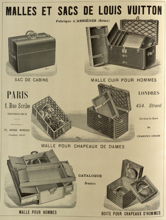
1. The mission and brand Identity of Louis Vuitton to” embody unique savoir-faire, a carefully preserved heritage and dynamic engagement with modernity and to represent the most refined qualities of and around the world; to be synonymous with both elegance and creativity; to blend tradition and innovation, and kindle dream and fantasy”, to be creative and aim for excellence.
2.What is the positioning of Louis Vuitton? I think that quality, luxury and real handcraft is the positioning.The logo is sanserif and that means that this is a company with a history, the golden colour tells me that its luxury and high quality and soothing unique.
Brand positioning Louis Vuitton LV brand positioning is the potent symbol of modern Style
These special collections feature the artists’ artwork while introducing a radical twist in the brand’s timeless design. Louis Vuitton offer high quality designer apparel, footwear and accessories.
3.The Speedy was first created in 1930 in the 30cm size, which was then called the «Express» as an homage to the era’s travel revolution.
The smaller 25 was added in 1959 at the request of actress Audrey Hepburn, who wanted Louis Vuitton to make a mini version of their Keepall duffle. Louis Vuitton obliged and created what is now known by fashionistas and handbag lovers as the “Speedy 25.” The Speedy didn’t become the iconic bag it is today until Audrey Hepburn’s Speedy 25 was Introduced.
I think the strategy of The speedy monogram 30, is to bring the old unique design back from the history and create a new product to the target group, something to use every day.
4. They had to define their target costumer and make a customer profile.
5. How the logo fits in with the brand positioning. The logo is the first types in the founders first- and surname. Louis Vuitton. The LV makes a symbol. This make the logo look expensive and unique and it tells me that I is a company or product with history. The golden colour and the metal finich is luxery and solid.
The LV logo reflect in a good way the brand positioning and that the logo has meaning and that the name belong to the founder gives it a unique possibility and its not so easy to copy. The golden monogram is perfect to use on this types of luxury products.
Brand Identety
TASK 2.2
How is the brand identity enhanced (or perhaps, not expressed) at the point of customer interaction?
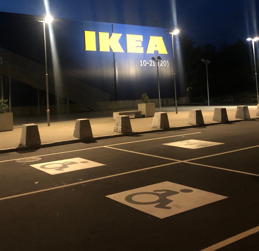
In this task I choose to do research on IKEA brand. The brand is well-known, and my task is to visit the shop and see how their products are displayed or distributed.
1. The branding element IKEA is using in their logo is WORDMARK. The types has a meaning and tells about the identity.
I – Ingvar (the first name of the company’s founder)
K – Kamprad (the surname of the company´s founder)
E – Elmtaryd (the name of the farm where Kamprad grew up)
A – Agunnaryd (the name of his village)
2. IKEA´s brand positioning is to be the leading home furniture experts who offer quality and design products to a lower price.
“To create better everyday life for the many people” From beds and mattresses, organization appliances, rugs, décor, kitchen and furniture, the brand provides everything you can think of to make your life good.
The colours of the logo and brand also is a part of their identity. Blue and yellow is the colours in the Swedish flag. It also identifies the main style Scandinavian Design. Everything in this company relate to the Swedish and Scandinavian history and culture. Such as light, material, style history, humanism and handcraft.

The target group I think is single and in relationship 20 – 45 years old, but also family and children.
3. At the shop it is easy to see the logo and the identity of IKEA, first you meet a “Welcome” , it is easy to find a place to park your car and you can find sign for family, electric car and handicap parking.

The logo you can see everywhere, it´s included in everything you see, shelf tag, price tag on product, price signs and on the product itself.


The blue and yellow is also easy to see all the way throe the store.
The product selection is something for everyone and for every wallet.
There are displayed products in different style, different, price and given good home furnishing tips for storage, quality and how to mix colours.

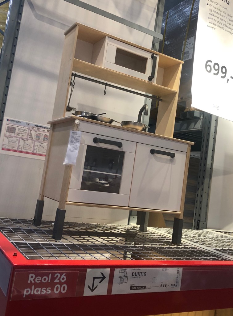
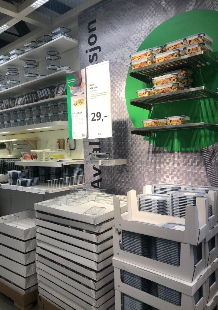
fore sample this kitchen for children.
4. When you arrive to the store the brand positioning is clearly, outside you meet the Swedish flag and the flag for the country the stores’ location is. There are also flag with the logo.
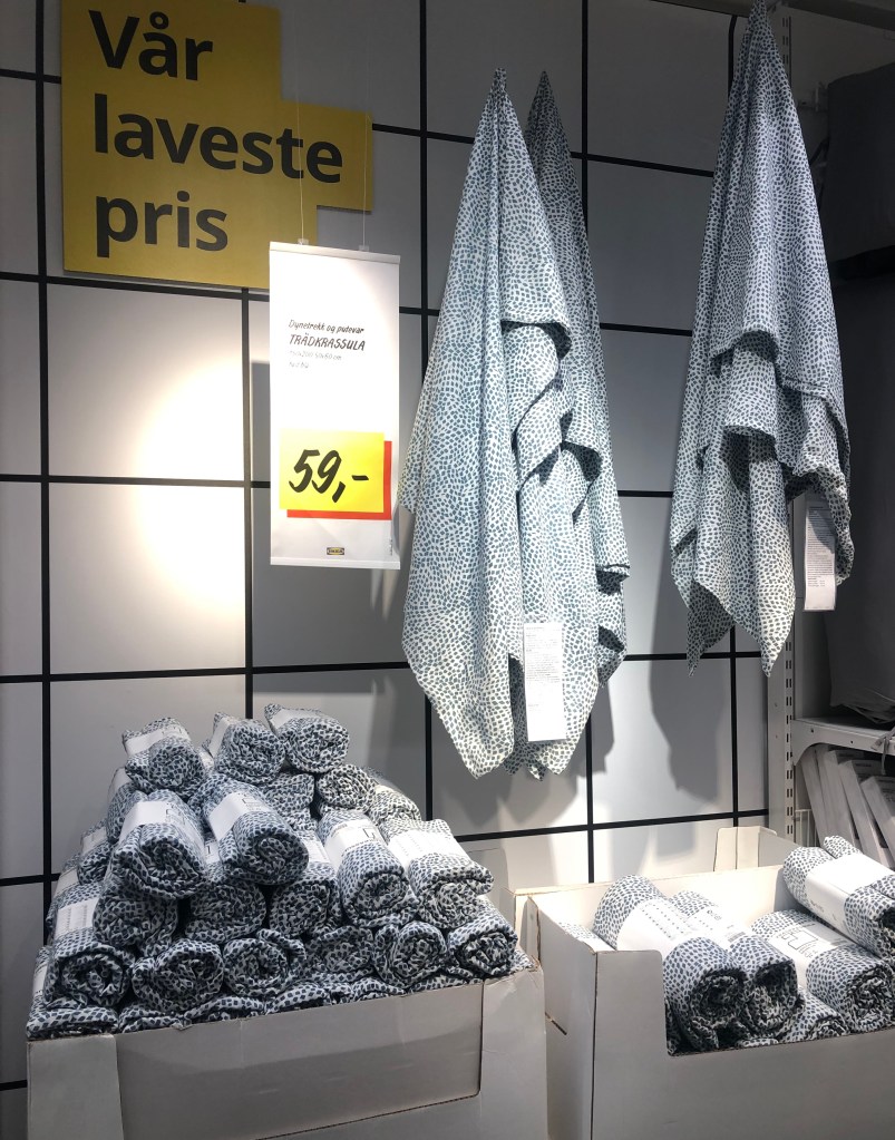
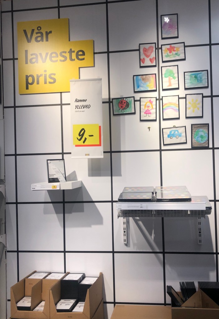
In the entrance you find a product on the wall with a good and low price, there is also displayed products on podium whit home furnishing expertise to create inspiration and knowledge to the costumer. All the way thru the market hall you find home furnishing expertise, and customer benefit communication.
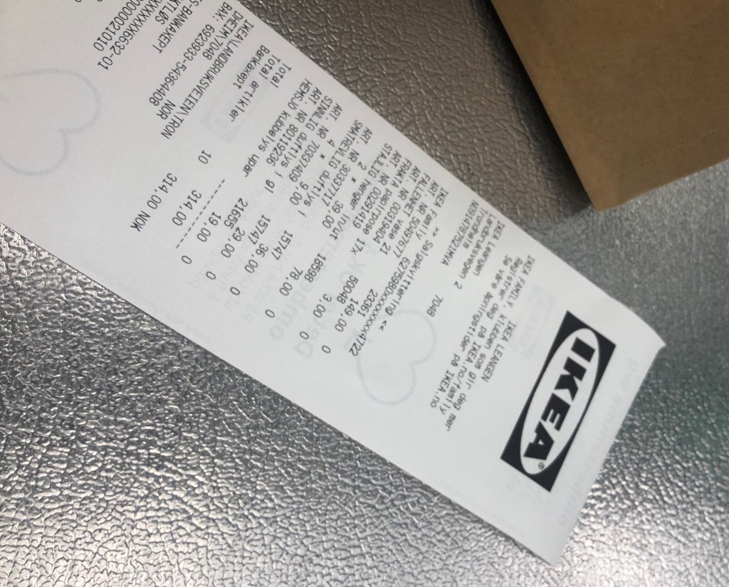
The low price is easy to find and are displayed all the way true the store in every range.

This break gives the customer information about environment and is a part of the sustainability strategy.
The logo is visible everywhere and because of the good known brand I see it as a quality stamp.

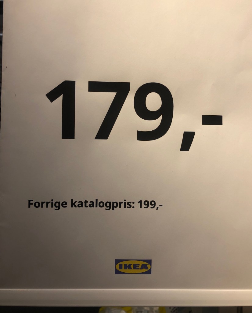
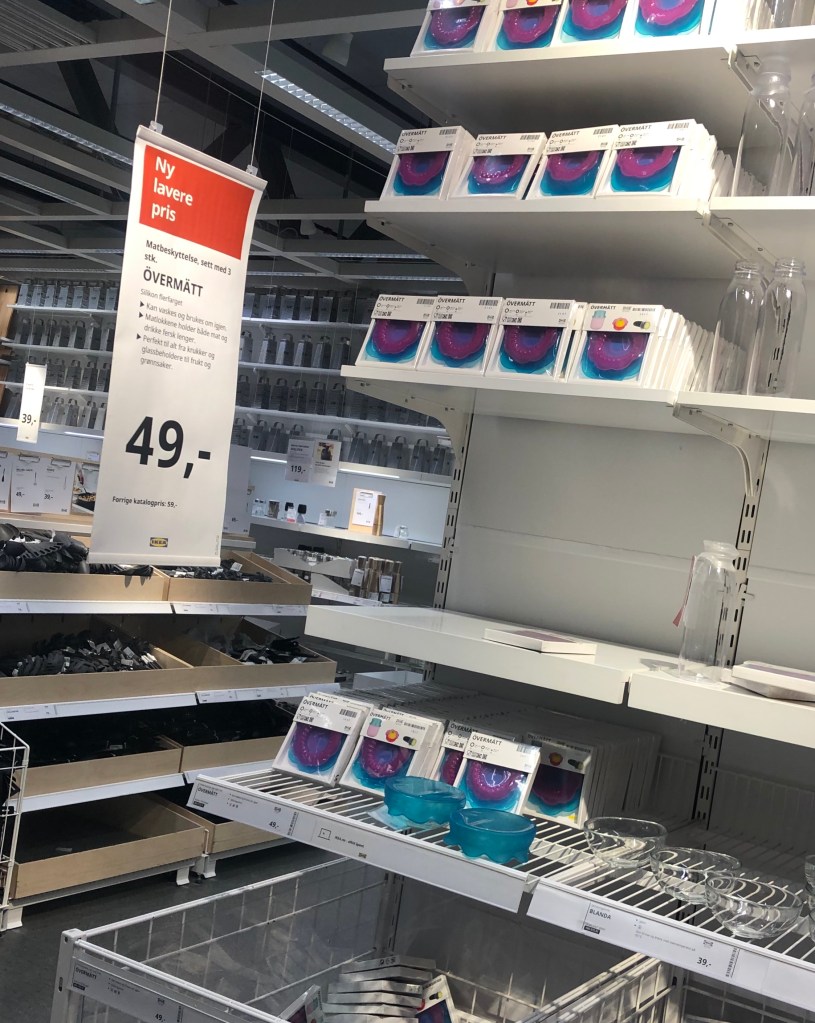
5. The brand ideal is quality design for a low price. IKEA display their product in different technique depending of price and quality. I can also see that they are up-date on season.
Example of display technique’s they use to show difference on price and quality.
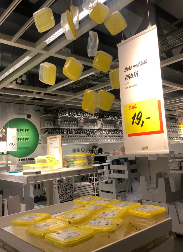
Example of display that shows home furnishing expertise.


How display shows innovation and high price. High price at IKEA is low price in the market.

This display gives a home furnishing expertise also using communication. And the logo in colour gives it the final touch.

Living with children displayed. You also find product for children in other areas in the store, not only in ChildrenStore.

The IKEA brand is strong and the visual display accord to the brand ideal, back at the parking area I find board that communicate home furnishing, low price, logo, colour identity and product right for the season. You can see a strong link to the brand identity, store, internet and communication.

MODUL 1 – Brand Position
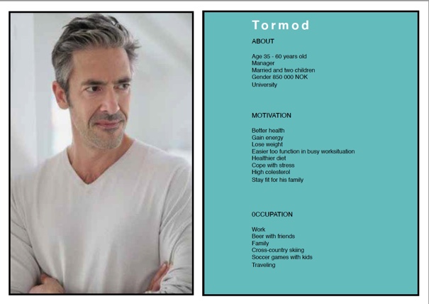
Task 1.1.
This week my task is to create Customer profile for two different profiles for a fictional fitness coaching brand.
In a customer profile it is important to include knowledge about those you find as you’re specific demographic to target. I looked at women and men as a target that need this type of offer and who are likely to buy it.
My research landed on Female 30 – 45 years old and male 30 – 50 years old.

Task 1.2. Mood board
I created a mood board for the fitness brand that I started working on by making consumer profiles.
I had to think of the main targets needs and their goals – and create a dream.

MODUL 3 – Logo design and Brand Manual.
3.1. Designing a logo

My first sketches working with the Fitness caching logo.

Working with my ide I started creating on Adobe illustrator.
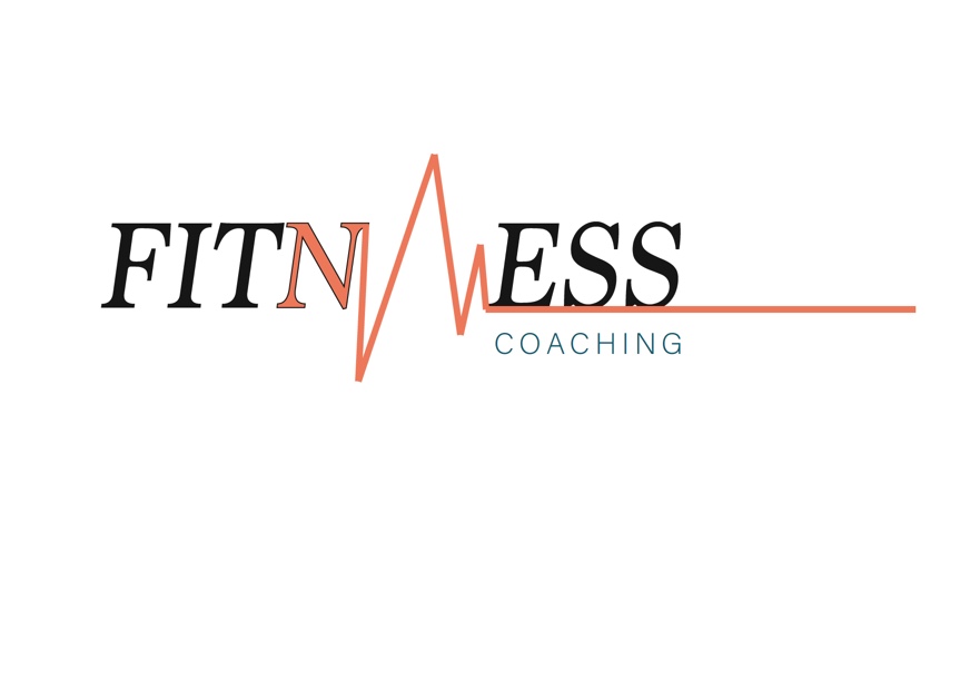

This is the one decided to go for.

MODULE 1- The history of Photography and Camera Basics.
INTRODUCTION
Throughout this lesson, I have learn about the various inventors that contributed to the art of photography. With some to ashine a better knowledge about the history of photography, have chosen an inventor, I find very interesting. My research will show more hove he has contributed to modern photography.
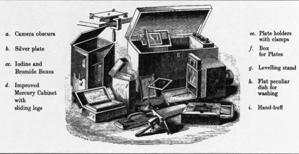
My chose is LOUIS JACQUES MANDE` DAGUERRE and the DAGUERREOTYPE.
I want to learn more of his inventors because I think these images are beautiful and makes me curious of the process. A Daguerreotype is not a photography like we know it, as a picture on a piece of paper. It is a strange and fascinating image that is both two and three dimensional. Daguerreotype is also referred to as a “MIRRORS WITH MEMORY”
INTERPRETATON OF THE TASK
To find out more about this inventor and his work I used internett. For research.
RESEARCH AND WORK PROCESS
Daguerreotypes are an answer to the romantic struggle and got its start when the observation on that some chemicals were light sensitive
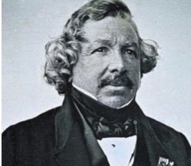
Daguerre himself was an academic trained French painter. He experimented with photo in 1824 and produced his diorama paintings. This was low scale paintings that he put into the dark room, he gave the paintings light in different ways, this gave the paintings different mood for example, foggy, sun or darkness. He sold seats and it was like a theatre or a cinema.
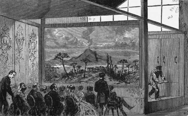
Louis Daguerre was an entrepreneur and a showman interested in display and presentation.Daguerre fixed his pictures on a mirrored metal plate, unlike the negative/positive process, Daguerre produced one-off images like a polar vide. The image is contemporary, and it produces an experience that is unique.In the 19th century it was preferred to as a “mirrors with memory” a good description on wat daguerreotype is.

Daguerreotype is not like a normal photograph, the light operates different on a daguerreotype, the silver grey on the image sits up on the top of the surface. What you see is light reflected thru an image, the people on the image don’t exactly look alive, but at the edge being present.
Because the plate that are in camera is the plate you shoot on also is the one that are displayed, you cannot make multiple reproductions from the original image. It is an intimate process, and the images was only for few of us.
The image is made on a polished copper plate that is highly reflective. Due to the reflective nature of it, you can only see the image come in from a specific angle. Daguerreotypes were meant to be handled for that reason; you need to move them about to find the image. If you view it from the wrong angle the image appears as a negative. They are also mirror images of the subject because they are viewed from the same side of the plate that originally faced the camera, the process of making the Daguerreotype was formalised and Daguerre himself wrote and distributed an instruction manual in 1839.
Whit the daguerreotype the photographic history begins to change.
Because that this method was not able to reproduce and all development mostly are driven by fame and money, other inventors started develop the ide’ and it became a competition between several people to com up with the best innovation.
The daguerreotype process was the first practicable method of obtaining permanent images with a camera.
RESORCES
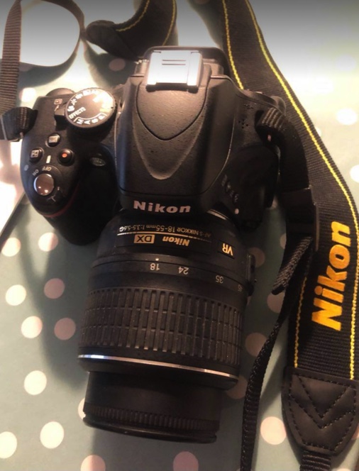
1.2 Camera Basics.
The name of all the functions/buttons on the front of my camera.
1.

1. Mode dial
2. Live view switch
3. information button
4.Movie-record button
5.Exposure compensation button
6.Shutter-release button
7.Power switch
8.AF-assist illuminator, Self-timer lamp, red-eye reduction lamp
9.Infrared receiver
10.Body cap
11.CPU contacts
12.Built-in flash
13.Flach mode button, flash compensation button
14.Speaker
15.Focal plane mark
16.Eyelet for camera strap
17.Microphone
18.Connector cover
19.Self-timer button
20.Mounting mark
21.Lens release button
22.Mirror
23.Lens mount
24.Accessory shoe cover
25.Accessory shoe, for optimal flash unit
26.Accessory terminal
27.USB and A/V connector
28.HDMI mini-pin connector
29.Connector for external microphone
The name of all the functions/buttons on the back of my camera.
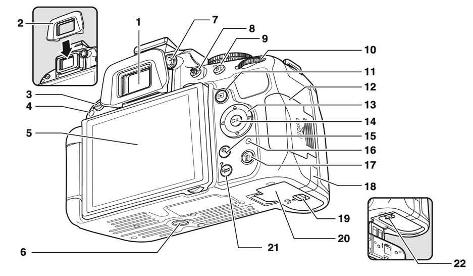
1. viewfinder eyepiece
2.Rubber eyecup
3.MENU button, two-button reset button
4.Infrared receiver
5.Monitor
6.Tripod socket
7.Diopter adjustment control
8.Information button
9.AE-L/AF-L button
10.Command dial
11. playback button
12.Memory card slot cover
13.Multi selector
14.OK button
15.Playback zoom in button
16.Memory card access lamp
17.Delite button
18.Power connector
19.Battery-chamber cover latch
20.Battery-chamber cover
21.Zoom out button
22.Battery latch
3. ISO
ISO is your camera’s sensitivity to light as it pertains to either film or a digital sensor. A lower ISO value means less sensitivity to light, while a higher ISO means more sensitivity. I think in the beginning I would set it in the AUTO mode. ISO setting effect the image settings sensitivity to light, the higher number the less light is required to properly expose the image sensor.
ISO function by press the info button and use the Multi-selector to find the ISO.Then much the OK button and choose the ISO number you will use, with the Multi-selector and such OK again.


4. APERTURE
Aperture can be defined as the opening in a lens through which light passes to enter the camera. The f-numbers like f/1.4, f/2, f/2.8 and so tells us what the size of the lens opening, which can be controlled through the lens or the camera.Aperture is to control the dept of field in an image.Dept of field is the term to describe the destination between the nearest and the forest object in the scene .
Smaler DF. Set the Mode dial on A, press the sutter button halfway down and set the Aperture value that you want and then press the button down to take the image.
I think for my use I most of time will use less light for better focused images.

5. SUTTER SPEED
Sutter speed is a function you use when you need to control in motions in a scene. Freezing action or blueing the motion on the subject.
Set the Mode dial to S, SUTTER BUTTON half way down to allow the camera to focus… then rotate the Command dial to set the sutter speed you want to use.